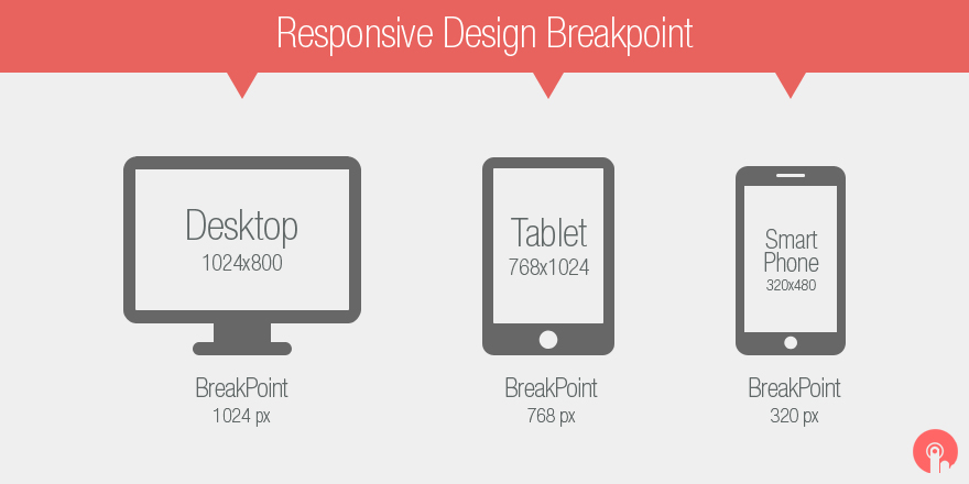
A breakpoints is the media query values that will mark the transition to a new class of devices.
2012 predicted that by 2013, mobile devices would overtake desktop PCs as the dominant global Internet platform, with a projected 1.9 billion users on mobile devices in 2015, compared to “only” 1.6 billion desktop internet users. So why haven’t you started creating responsive websites yet?
Responsive Design is not the same as mobile design. Mobile design entails creating an entirely new website or web app with content specifically created for the mobile experience. Responsive Design, on the other hand, means that the same domain, the same content, and the same syntax — more or less manipulated by JavaScript and/or CSS3 Media Queries — respond to different view-ports to provide the best user experience possible for each device. The different viewports include desktop monitors, laptops, tablets, and mobile devices and their corresponding orientations.
Responsive Web Design allows for the design to be flexible and fit to the size of the viewing screen on the device.Developed an interactive demo to see how it works (Try Marionettes Responsive Web Design Demo Here). Since Responsive Web Design conforms to the screen, viewers gets their best experience when they on your site.
